To better understand two of the projects for a Bredemarket client, I asked Google Gemini for an explanation of the differences between OpenAPI versions 3.1.1, 3.1.2, and 3.2.
Google Gemini provided me with that explanation.
Then I supplied the following prompt:
Rewrite the above so a marketer can understand it.
Here is part of what Google Gemini provided to me.
🏗️ OpenAPI 3.1.1 & 3.1.2: The “Under the Hood” Fixes
These versions were like a restaurant updating its internal plumbing. They didn’t change what was on the menu, but they made sure the kitchen (the code) followed the latest global safety standards (JSON Schema).
The Goal: Accuracy and stability.
The Benefit: It ensures that when a developer tries to connect to your service, they don’t run into “grammar” errors in the documentation.
✨ OpenAPI 3.2: The “UX & Branding” Upgrade
Released recently (late 2025), this version is all about making your API easier to sell and easier to use.
1. Organized Menus (Hierarchical Tags)
Before, your API list was just one long, flat list of features.
Old way: A messy “junk drawer” of links.
3.2 way: You can now create folders and sub-categories (e.g., Payments > Refunds > International). This makes your documentation look professional and much easier for customers to navigate.
2. Better Support for AI and Live Data (Streaming)
If your product uses AI or real-time data (like a live stock ticker or a ChatGPT-style chat), 3.2 is a game-changer. It has a specific way to describe “Streaming” data so developers know exactly what to expect from your “live” features.
3. The “Smart Search” (The QUERY Method)
In older versions, developers often had to “hack” the system to do complex searches. 3.2 introduces a dedicated Search button (the QUERY method) that is cleaner, safer, and follows modern web standards.
4. IoT & Smart Device Support
If your product works on a Smart TV, an Apple Watch, or an IoT device, 3.2 finally adds official support for “Device Pairing” (that thing where you enter a code on a website to log in to your TV).
Hey, it helped me. Marketers need to eat, and writers understand grammar.
If you’re not familiar with the complete history of the Eagles, you may not know that they began as practitioners of country rock. Their early songs were therefore softer than the ones from the Joe Walsh years.
One of those songs (actually later, but earlier in feel) was “Lyin’ Eyes.”
Glenn Frey and Don Henley could tell stories with the best country songwriters. And this was no exception, with a tale of a woman seeking solace outside of her marriage. Her life gets more scattered, until the singer turns judge and announces, “My, oh my, you sure know how to arrange things.”
But before that, when the singer is merely telling the story, the woman needs to seek solace.
Google Gemini.
So the singer says what the woman is doing:
“She is headed toward the cheatin’ side of town”
Now this is a lyrical fiction.
To my knowledge, no town in California or anywhere else enforces residential zoning regulations that segregate cheaters from non-cheaters. When “the boy” in the song rented his apartment (in Buena Park?), he didn’t need to indicate his receptiveness to desperate housewives. (Different decade, I know.)
Google Gemini.
So if the cheatin’ side of town is not a geolocation, is it perhaps tied to another factor of authentication?
After all, you could use non-identity biometrics such as respiration to discover the intent of a woman, whether she is driving
to comfort an old friend who’s feeling down, or
to rush into a man’s arms as they fall together.
Cheaterland is a state of mind. My, oh my.
Google Gemini.
And if I may interject an author’s note, I am VERY impressed with Google Gemini (Nano Banana 2) for knowing what a “Thomas Brothers Map” is. Except that I had to change my story setting from North Hollywood to Buena Park to match the images.
“Life in the Fast Lane,” of course, would need a Los Angeles County map.
Vibe coding is real…and you can do it yourself for free. Since I’m on the Google platform, I used Google Gemini to guide me through the steps.
Specification
I started informally:
Online analysis of the chief biometric news from the last seven days, sorted into finger, face, iris, voice, DNA, and other.
Google then formalized a Product Requirements Prompt for Build Mode for Gemini AI Studio (which I had never used before). It made all the UI choices, which I didn’t change (although I haven’t used green on black since the DOS days).
You are building “Biometric Pulse 2026,” a high-frequency, automated data dashboard and visualization tool.
The Vibe: Minimalist, data-dense, dark mode (matrix-green and stark white accents), 1980s retro-futurist ‘terminal’ aesthetic. High information density with zero clutter. The app must feel intelligent, real-time, and analytical.
2. FUNCTIONAL SPECIFICATIONS
The application is a full-stack automated news and regulation analyzer. It must perform the following tasks without user input:
Phase 1: Data Ingestion (Automation)
Source Strategy: Use a hybrid approach:
Google Search API (Real-time): Schedule a request every 4 hours for the query "biometrics industry news" OR "facial recognition technology" OR "iris scanning update" OR "voice biometrics market" OR "DNA border control policy" OR "biometric regulation". (Grounding is required).
Web Scraper (Targeted): Target specific domain feeds for deeper insights (e.g., BiometricUpdate.com, SecurityInfoWatch, specialized legal/regulatory feeds). If you cannot build the scraper, mock this data with realistic data from the last 7 days.
Date Filtering: Automatically filter all results to only include data from the last 7 calendar days (using the current date dynamically).
Phase 2: AI Classification & Analysis
Categorization: Use Gemini 3 Flash to analyze the title/snippet of every news item and classify it into one or more of these 6 buckets:
The main view is a single-page, real-time updated dashboard.
Component A: The Pulse Feed (Primary View)
A vertically scrolling list of news items.
Items must be chronologically sorted (newest first).
Card Design: Every card must have:
A clear category icon/tag (e.g., [ 👤 FACE ] in bright green).
An automated, one-sentence summary (using Gemini).
The primary source link, relative date (“2 days ago”).
Sentiment analysis tags.
Component B: Filter Terminal (Left Sidebar)
A stack of minimalist buttons for the 6 primary categories.
Show the live “count” of articles found in the last week next to each (e.g., [ 👤 FACE (14) ], [ 🧬 DNA (3) ]).
Clicking a category filters the Pulse Feed instantly.
Component C: “The Weakly Pulse” Chart (Right Sidebar)
A stacked bar chart visualization.
X-Axis: The 6 modalities (Face, Finger, etc.).
Y-Axis: Number of news events reported this week.
Color Code: The bars should show sentiment (e.g., red for surveillance/privacy concern; green for innovation/market growth).
4. TECHNICAL ARCHITECTURE & STACK
Model: Gemini 3 Flash (required for continuous analysis and low latency).
Integration: Google AI Studio Build Mode.
Runtime: Node.js (Vite server for the frontend).
Package Needs:react-query (or simple useEffect for data fetching), chart.js (for the weekly pulse chart), and a minimalist CSS framework or Tailwind (but customized to the dark terminal look).
Deployment: Pre-configure for One-Click deployment to Google Cloud Run.
Use
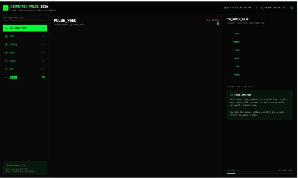
So there it is. I went into Google AI Studio and used Build to build the thing, and without publishing it, I ended up with something that looked like this.
Biometric Pulse 2026, as of the afternoon of March 2, 2026.
It certainly has the retro user interface…but if you look carefully at the data, there isn’t any. I don’t know if I have to wait four hours for the data to auto-refresh, or if I actually have to publish it to have it generate data. Or buy tokens or something.
But if I can get this to actually work, I’ll have proven that you can easily specify simple tasks using modern tools.
Sometimes I write pieces that cover multiple topics, in this case both a technical analysis of digital asset taxonomies and classifications in a multi-faceted sense, and a musical analysis of the multi-faceted genres present in a single song. Whoops, two songs. (One track.)
Because the source picture used to generate the song is not exclusively biometric in nature.
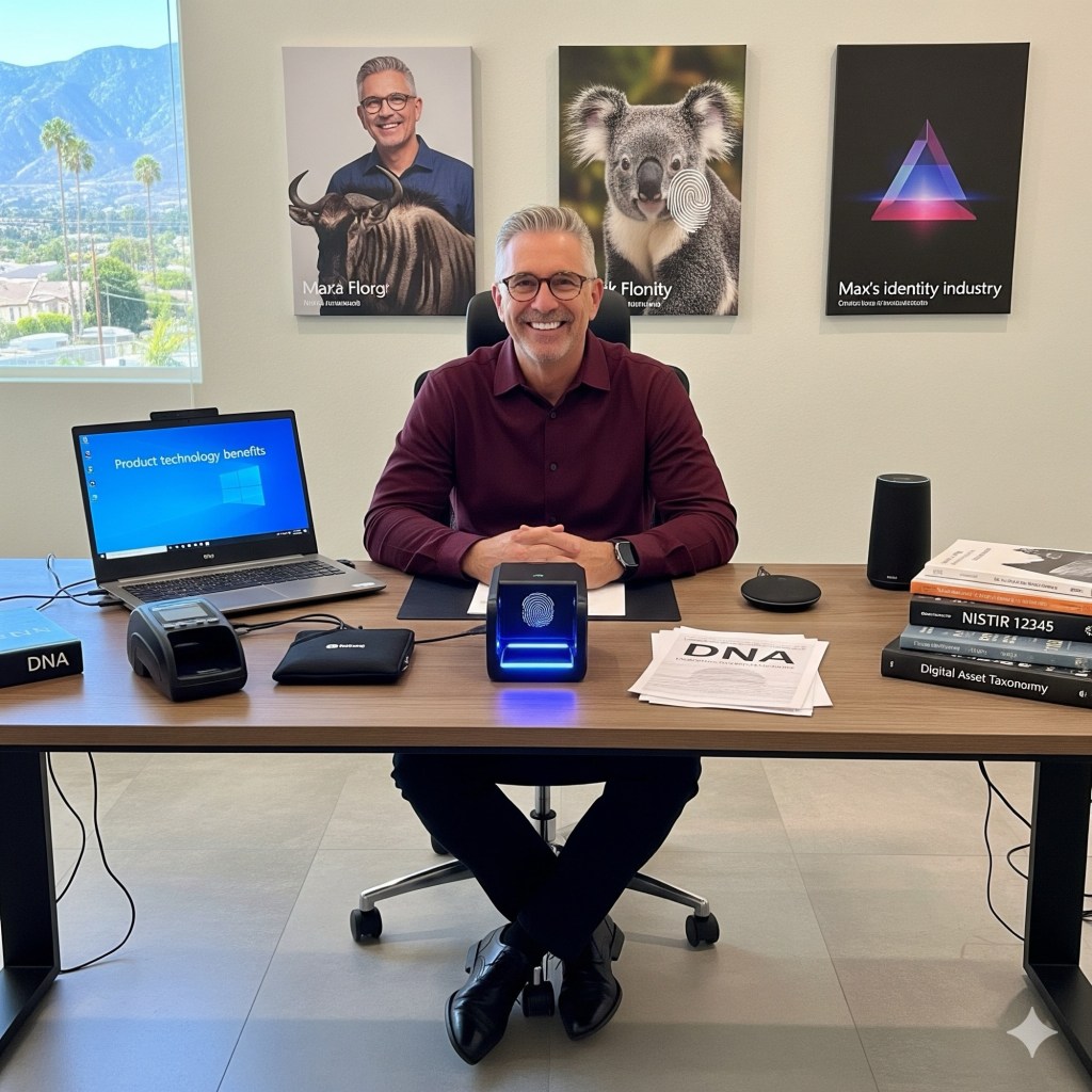
Identity and non-identity technologies. Gemini.
If you look in the lower right corner of the picture you can see a reference to digital asset taxonomy, a reference to a Bredemarket client that specializes in Adobe Experience Manager implementations.
Which brings us to Spotify.
Building the perfect Spotify playlists
Every month without fail I build at least one Spotify playlist for my listening pleasure. Normally these are a mixture of different decades and genres, all thrown together.
Saturday (February 21) I thought I’d be more thematic and create multiple playlists sorted by genre. So far I’ve created four:
Dance, including the Andrea True Connection and Britney Spears.
Electronic, including Kraftwerk and Röyksopp.
Folk, including the Brothers Four and R.E.M.
Punk, including Public Image Ltd. and Hole.
I tried to stay away from traditional categories such as country and disco, and didn’t try to distinguish between punk and hardcore, or genre and NEO-genre.
And I recognize that artists can span multiple genres. Some Devo songs are in my electronic playlist, others are in my punk playlist, and when I get to “Disco Dancer” it won’t go in either.
Which brings us to Elton John.
Building the imperfect digital asset taxonomy
Elton John’s career has spanned multiple genres. The bespectacled piano player has covered simple love songs, energetic power trios (17-11-70), bombastic orchestral episodes, crocodile rock, an island girl, and everything else. And that’s just in his first decade, before he became Disney soundtrack guy.
However, in most cases Elton, Bernie Taupin, and his other collaborators would stick with a particular genre for an entire song. Because that’s what good product marketers do: stick to a single message. Bad product marketers like me tend toward multiple message overload…I seem to have strayed from my point. *** EDIT THIS LATER
But perhaps you noticed the music I incorporated here.
How do you taxonomize THIS digital asset?
1973 in music
Before I describe the problem, let me set the scene.
“Goodbye Yellow Brick Road” was the second of two albums that Elton John released in 1973. It was a sprawling double album.
Elton’s predecessor album, “Don’t Shoot Me I’m The Only Piano Player,” was a number one album with a number one single, the aforementioned “Crocodile Rock.” The album also included the popular song “Daniel” and a character piece (in the Randy Newman tradition) “Texan Love Song.” (Lyricist Bernie Taupin often courted controversy.)
But much was going on outside the pop star world that Elton John seemingly occupied. Progressive music was reaching its peak. While Elton’s first 1973 album rhapsodized on elderberry wine and backed away from the Paul Buckmaster arrangements, 1973 saw releases from Emerson Lake and Palmer, Genesis, Jethro Tull, King Crimson, and Yes. Oh, and an album by Pink Floyd entitled “Dark Side Of The Moon.” When I asked Google Gemini about 1973 progressive albums, it replied in part, “If you enjoy odd time signatures and 20-minute compositions, 1973 is your playground.”
However, music is governed by Newton’s Third Law of Motion, and some definitely anti-progressive works were just starting to appear. The New York Dolls released an album, and underground recordings were circulating of a band called The Modern Lovers.
A significant portion of American teenagers didn’t care about any of this. For them, the ONLY album of importance was Led Zeppelin’s “Houses of the Holy.”
Side one of four, track one, songs one and two
Which brings us to “Funeral For A Friend”/“Love Lies Bleeding.” Technically a two-song medley, but distributed (both physically and electronically) as a single asset.
Elton had tons of fans who were all too happy to rush out, slap $9.98 on the counter to buy “Goodbye Yellow Brick Road” upon its release, and plunk side one of the first record on their turntables.
Time to listen
I suspect that the “WTF” acronym was invented in November 1973.
WTF?
Because the listeners weren’t hearing “the only piano player.”
And they weren’t hearing a Paul Buckmaster-conducted orchestra.
You couldn’t hear a recognizable piano until the 1:40 mark of the song. Slowly you hear Dee, Nigel, and Davey, and the song slowly (but not completely) transitions away from the Hall of the Progressive Masterpiece in the Court of the Multi-Coloured Bespectacled Lunatic on the Top of the Charts. (And no, “lunatic” is not too strong here, since this song falls between Elton John’s known suicide attempts in 1968 and 1975.)
Then, after the band (augmented by Hentschel) brings “Funeral for a Friend” to an energetic conclusion, the piano player transitions to the second song at the 5:22 mark. And Elton, who has been silent all this time, finally sings.
And time to reflect
Let’s review, shall we?
Although the tone is dark with themes of breakup and demise, portions of this sound like a typical Elton John pop song.
But before that it begins with sounds that made American teenagers wondered if they had picked up a Yes album by mistake.
And while few portions of the songs are minimal like Mr. Richman, or include towering solos like Mr. Page, parts would have fit well into a New York studio performance three years earlier. And Elton at his best could outdress the Dolls.
That was fun. Now comes the challenge.
How do you classify THIS?
I’ve already implicitly noted that music classification is a tricky affair.
Take “MacArthur Park,” a song recorded by everyone from Richard Harris to Waylon Jennings to Donna Summer. There are over 200 versions of the song spanning multiple genres. And composer Jimmy Webb is challenging to classify.
Now look at Elton’s song and my four playlists.
The track isn’t folk, dance, or punk.
But is it electronic? Portions are decidedly NOT.
Multi-faceted
You could cheat and place it in two (or more) classifications. Heather Hedden addresses faceted classification:
“The idea of faceted classification as a superior alternative to traditional hierarchical classification, whereby an item (such as book or article) can be classified in multiple different ways instead of in just a single classification class/category, is not new. The first such faceted classification was developed and published by mathematician/librarian S.R. Ranganathan in 1933, as an alternative to the Dewey Decimal System for classifying books, called Colon Classification (since the colon punctuation was originally used to separate the multiple facets).”
A taxonomy, however, is different—ideally:
“[F]aceted taxonomies should…ideally be mutually exclusive, in contrast to the principle of faceted classification…”
My solution
Returning to my Spotify playlist problem:
I could simply place the song in multiple playlists: for example, an electronic playlist and some type of guitar/rock/whatever playlist.
Or I could create a single hyphenated playlist, such as an electronic-guitar playlist. (Many Depeche Mode songs, beginning with “Route 66,” would be ideal here.)
For now I followed neither option, but added “Funeral for a Friend”/“Love Lies Bleeding” into my existing electronic playlist (because it starts electronically) and nowhere else.
There are many controversial uses of land, one of which is data centers. And most of us use them.
When I use SaaS resources or generative AI tools, I’m making use of a data center…somewhere. For example, when I created the image at the top of this post with Google Gemini…and when I uploaded this post to WordPress so you could read it.
But what if the data center was next door to ME? Would I feel differently about data center use?
Warren County, Virginia (Front Royal) is more rural than other counties in the state, such as Fairfax County. And someone is proposing a data center in Warren County.
This prompted a letter to the editor from Cara Aldridge Young, a former high school classmate of mine. (And a talented editor herself, if your company needs one.) Young examined the negatives surrounding data centers:
“Data centers are not quiet, invisible neighbors. They are warehouse-scale buildings surrounded by substations, transmission lines, backup generators, cooling systems, security fencing, and 24-hour lighting. They require enormous amounts of electricity and millions of gallons of water for cooling. In a county that has already experienced drought restrictions and ongoing grid concerns, it’s fair to question whether we are equipped to support that scale of development without long-term environmental and infrastructure consequences.”
I don’t have a feel how Warren County will respond to this request; I haven’t visited Front Royal in decades. But Young presumably isn’t the only resident with concerns about power, water, and the environment.
But I’m sure there are counties that would welcome the economic development, the tax revenue, and the jobs. (Well, not that many jobs.)
On my side of the country, the big infrastructure concern is warehouses, such as the Amazon distribution center in Eastvale, California.
One of Amazon’s buildings in Eastvale, California.
“Since launching the Gemini app, we’ve built tools to encourage creative expression through images and video. Today, we’re taking the next step: custom music generation. Lyria 3, Google DeepMind’s latest generative music model, is rolling out today in beta in the Gemini app.”
I used this prompt to generate a Lyria tune:
“Create music for a wildebeest using a laptop to compare a latent fingerprint to a tenprint fingerprint”
Google’s response:
“’I’ve created a unique atmospheric track for you that blends electronic data-processing sounds with the deep, resonant textures of a wildebeest’s world. You can play the music directly here in our chat!”
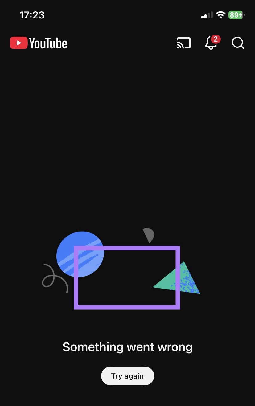
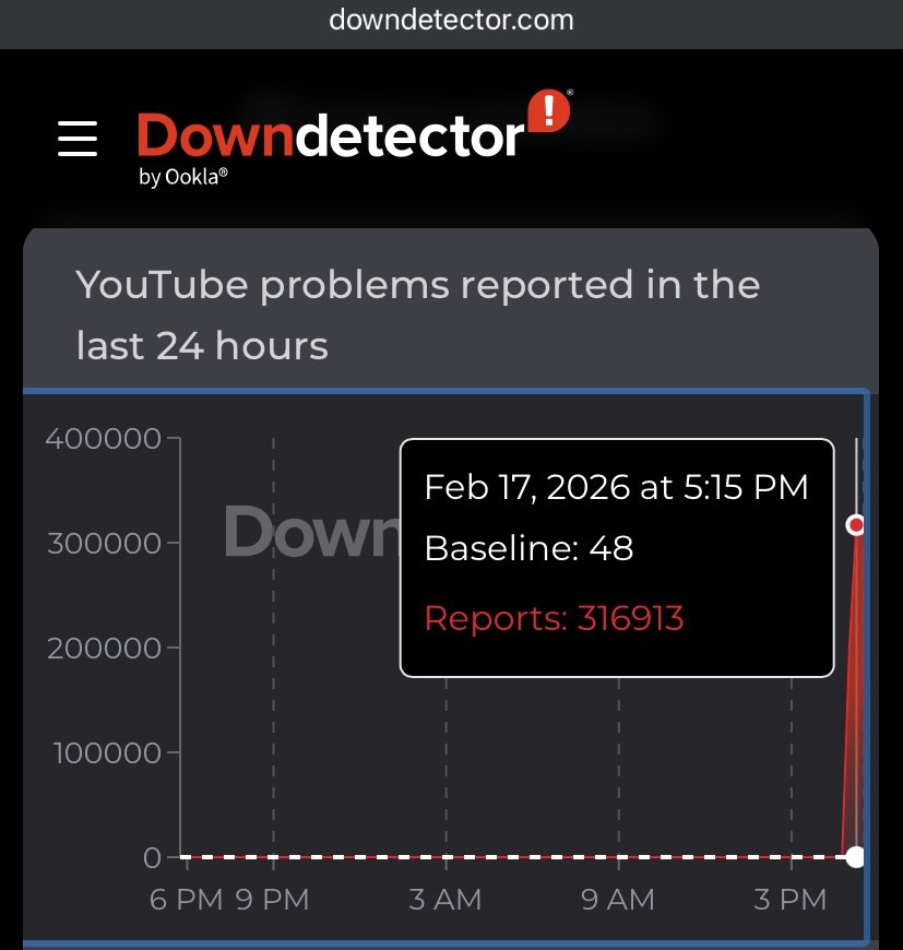
However, the only news from these sources was that hundreds of thousands of people were reporting the issue to Downdetector.
Downdetector, 5:15 pm PST yesterday.
However, the site wasn’t COMPLETELY down. If you had a direct link to a YouTube video, you could still watch it. I confirmed this by watching the YouTube version of one of my Bredemarket promotional videos.
“An issue with our recommendations system prevented videos from appearing across surfaces on YouTube (including the homepage, the YouTube app, YouTube Music and YouTube Kids).”
Since recommendations appear almost everywhere, just about everything was affected. Because YouTube, like most other social services, can’t just show “the site”; it has to show what it thinks you should see.
Think about it. What would YouTube look like if it couldn’t recommend anything?