Yesterday I realized that “I ask, then I act” is not a complete description of my process.
Sometimes, before I ask, I guess.
Sometimes I guess correctly, sometimes I don’t.
But “I ask, then I act” is succinct.
Identity/biometrics/technology marketing and writing services

Yesterday I realized that “I ask, then I act” is not a complete description of my process.
Sometimes, before I ask, I guess.
Sometimes I guess correctly, sometimes I don’t.
But “I ask, then I act” is succinct.
Length. 2,400 words give or take.
And cost. For now, $1,500.
And, of course, development of the themes. A quick punch, or more elaborate?
Whatever length of content your story needs, Bredemarket can provide it.

It’s January 25. Take your Christmas tree down.

I discussed the whole “defund the police” movement years ago, and now in 2026 we are still depending upon the police to protect us.
According to KARE, here is what happened when the police investigated the death of Alex Pretti…or tried to do so.
“Despite having a signed warrant from a judge, the Minnesota Bureau of Criminal Apprehension (BCA) was denied access to the scene where a man was fatally shot by federal agents Saturday morning in south Minneapolis, according to the BCA.
“Minnesota BCA Superintendent Drew Evans said the department was initially turned away at the scene by the Department of Homeland Security (DHS), so the BCA obtained a warrant from an independent judge. Evans said the judge agreed that the BCA had probable cause to investigate the scene, but DHS officials wouldn’t allow the BCA access to the scene.”
And I might as well say this also…I don’t believe in abolishing ICE either.

Original reel at https://www.instagram.com/reel/DT5_BSSEmcn/
Marketing inertia freezes prospects.
Warm your prospects with Bredemarket’s product marketing services.
Thaw your pipeline:
Marketing inertia freezes prospects.
Warm your prospects with Bredemarket’s product marketing services.
Thaw your pipeline:

We commonly believe that modern people enjoy an abundance of data that historical people did not have. While this is often true, sometimes it isn’t.
Let’s look at the images we use in facial recognition.
ISO/IEC 19794-5 (Face image data) recommends a minimum inter-eye distance of 90 pixels.
But imagine for the moment that facial recognition existed 100 years ago. Could century-old film cameras achieve the necessary resolution to process faces on adding machines or whatever?
The answer is yes. Easily.
Back in the Roaring ‘20s, photographs of course were not digital images, but were captured and stored on film. During the 1920s a new film standard, 35mm film, was starting to emerge. And if you translate the “grains” in film to modern pixels, your facial image resolution is more than sufficient.
Here is what FilmFix says:
“Thirty-five-millimeter film has a digital resolution equivalent to approximately 5.6K — a digital image size of about 5,600 × 3,620 pixels.”
Yeah, that will work—considering that the Google Gemini image illustrating this post was generated at only 1,024 x 1,024 pixels.

A tech journalist, writing on their personal social channels, noted that they recently bought a laptop bag luggage strap…and was immediately added to the company’s mailing list.
Because when you buy one laptop bag luggage strap, you obviously need seven more.
But it’s really bad when you buy a refrigerator and the seller thinks you want more of THOSE.
As I’ve said before, there may be many different stakeholders for a particular purchase opportunity.
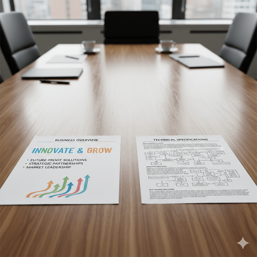
For the purpose of this post I’m going to dramatically simplify the process by saying there are only two stakeholders for any RFP and any proposal responding to said RFP: “business” people, and “technical” people.
Returning to my oft-repeated example of an automated biometric identification system purchase by the city of Ontario, California, let’s look at what the business and technical people want:

So both parties are reading your proposal or other document, looking for these points.
So who is your “target audience” for your proposal?
Both of them.
Whether you’re writing a proposal or a data sheet, make sure that your document addresses the needs of both parties, and that both parties can easily find the information they’re seeking.
If I may take the liberty of stereotyping business and technical users, and if the document in question is a single sheet with printing on front and back, one suggestion is to put the business benefits on the front of the document with pretty pictures that resonate with the readers, and the technical benefits on the back of the document where engineers are accustomed to read the fine print specs.
Or something.
But if both business and technical subject matter experts are involved in the purchase decision, cater to both. You wouldn’t want to write a document solely for the techies when the true decision maker is a person who doesn’t know NFIQ from OFIQ.

If your security software enforces a “no bots” policy, you’re only hurting yourself.
Yes, there are some bots you want to keep out.
“Scrapers” that obtain your proprietary data without your consent.
“Ad clickers” from your competitors that drain your budgets.
And, of course, non-human identities that fraudulently crack legitimate human and non-human accounts (ATO, or account takeover).
But there are some bots you want to welcome with open arms.
Such as the indexers, either web crawlers or AI search assistants, that ensure your company and its products are known to search engines and large language models. If you nobot these agents, your prospects may never hear about you.
And what about the buybots—those AI agents designed to make legitimate purchases?
Perhaps a human wants to buy a Beanie Baby, Bitcoin, or airline ticket, but only if the price dips below a certain point. It is physically impossible for a human to monitor prices 24 hours a day, 7 days a week, so the human empowers an AI agent to make the purchase.
Do you want to keep legitimate buyers from buying just because they’re non-human identities?
(Maybe…but that’s another topic. If you’re interested, see what Vish Nandlall said in November about Amazon blocking Perplexity agents.)
According to click fraud fighter Anura in October 2025, 51% of web traffic is non-human bots, and 37% of the total traffic is “bad bots.” Obviously you want to deny the 37%, but you want to allow the 14% “good bots.”
Nobot policies hurt. If your verification, authentication, and authorization solutions are unable to allow good bots, your business will suffer.
